
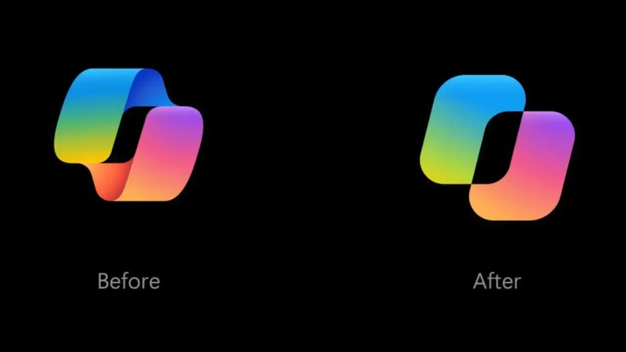
Microsoft spent months refining the visual identity of Copilot to better reflect its evolving role as an active assistant. The company redesigned the icon and wordmark to shift focus from a static logo to an interactive element that responds to the AI's current state. This change aims to make the interface feel more integrated into daily workflows rather than serving as a passive tool. Users will notice these updates across Copilot interfaces, including within Office products, as Microsoft seeks to clarify the AI's status at a glance.
New icon animations show thinking and searching states
The new icon features animations that indicate whether Copilot is thinking, planning, or searching for information. Microsoft emphasized the interactivity of Copilot in a lengthy post on its design blog. The company stated that as artificial intelligence continues to advance, new possibilities will continue to be created. Design gives meaning and form to those possibilities and helps them take root in people's daily lives.
The updated wordmark combines Segoe and Segoe Serif fonts to improve readability and personality. Microsoft redesigned the Copilot icon, spending several months on the process to ensure the visual language matched the product's capabilities. The updated design and animations are applied consistently across Copilot interfaces, including Office products. This consistency helps users recognize the AI's presence and status without confusion.
When we covered the last Copilot update, several of the same balance and stability themes came up. Microsoft continues to refine how the AI presents itself to users through these visual updates. The changes do not alter the underlying functionality but aim to improve the user experience through clearer visual cues. The redesign reflects Microsoft's ongoing effort to integrate Copilot more seamlessly into its software ecosystem.

Discussion
0 comments
Log in to join the thread with a thoughtful take, question, or correction.