
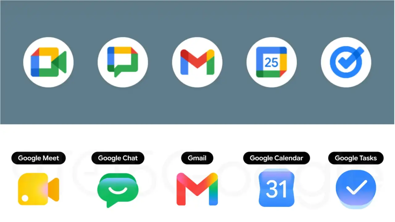
Google is updating the visual design of its Google Workspace applications. The company announced changes to all application icons on April 27, 2024. This update applies a gradient effect across the entire suite of tools. The update applies a gradient effect to all Google Workspace app icons.
The Drive icon now uses only green, yellow, and blue colors. It features a rounded triangle outline with a sharp inner triangle. The Docs icon retains a vertical paper shape. Sheets and Slides icons switch to a horizontal layout to reflect real-world usage. Meet keeps its camera shape but uses yellow as the primary color.
Gmail displays a rounded M envelope shape with red as the main color. The Calendar icon shows a page-turning design with a classic blue border. Keep focuses on a detailed lamp with the background page removed. Forms uses a multi-select bubble design with purple as the primary color. Sites transitions from dark blue to light blue in a horizontal design.
Google updates app icons with gradient effects and refined designs
Google is rolling out these new icons gradually to users. The company has not specified the exact timeline for the full rollout. The icon changes include specific design adjustments for Drive, Docs, Sheets, Slides, Meet, Gmail, Calendar, Keep, Forms, and Sites. Users will see the new icons appear over time as the update progresses.
Source: the source

Discussion
0 comments
Log in to join the thread with a thoughtful take, question, or correction.